Thursday, November 1, 2007
Performance Art
Performance art is ridiculous. As you can see from this video, it seems as though the entire purpose of performance art is to bring some sort of disruption out into the public -- for everyone to be forced into experiencing some sort of discomfort at your own hands. The fluxists and the dadaists try to justify it as being meaningful and self-satisfying, but I think it's just advanced forms of ADD manifesting in overactive imaginations. I mean -- honestly... why else besides that or drugs would someone cover their head in honey and gold leaf and explain to a dead rabbit in a low whisper what their drawings meant... I mean... seriously...
Seriously...
Doing the shadow activity with Niya was difficult because all I could do was laugh the whole time because I knew how ridiculous it looked / was.
The performance I made for class never made it up to youtube. I had one person stand on a chair while another person walked around that chair reciting the name of each immediate family member until they'd named them all. Then they would switch and keep doing so until someone forgot one of the names. It didn't work out that well, so I'm not upset that it's not on youtube. Here is Laure's though. I am the feet.
Thursday, October 18, 2007
Iconography
 source : http://www.nike.com/nikebiz/nikebiz.jhtml?page=5&item=origin
I think the Nike swoosh is a great example of effective iconography. In one line of varying thickness, the energy that is associated with sports-ware is captured flawlessly. You can tell from the swoosh that Nike is a company that is concerned with speed and quality, evident through their solid and minimalistic economical logo.
Sign - Something that is representative as something else and often has special meaning.
Logo - Something that is representative as a something else as a whole and should be easily recognizable and distinguishable from other things.
Symbol - Something that stands for itself, but also has a deeper second meaning.
Icon - Something that represents something that is of greater importance.
Friday, October 12, 2007
Museums in the Future~
Museums are some of my favorite places to be in the Washington D.C. area. I make special trips to see exhibits that I want to see and try to keep up with what is going on in the shrines of free entertainment that line the mall. There's a feeling that I get when I stand in front of an inspiring work of art that I can't get anywhere else. Recently, I saw the Morris Louis retrospective exhibit at the Hirshhorn; it was after a stressful day of class, and standing in front of the massive pools of color in a nearly empty space made all of the troubles that I'd just experienced go away. So, you can see why I would think that this new expansion of museums is both exciting and disheartening: exciting because it allows for me to expose myself to new things more easily, but disheartening because the idea of experiencing these things while packed in with hundreds of other people is very off-putting.
I believe that the problem of large crowds in museums is an over-blown one. I have yet to experience a time in a museum where I haven't been able to see what I want to see because of large crowds. Perhaps that's because I haven't been to any large museums to see internationally talked about exhibitions; however, the fact remains that I've yet to truly be uncomfortable in a museum, and I like it that way.
If museum expansion were to stain my experience at museums, I would stand whole heartedly against it. However, part of that experience is the vast collection of works that you're able to see in one space. If expansion is able to accomplish this, then I don't have a problem with it. Expansion allows for more space which helps to alleviate the problem of congestion. Some people also complain about the architecture of the expansion, claiming that new minimalist constructions distract from the more traditional collections inside. However, I think that this is a problem that could be easily fixed. When you're inside of a gallery, you're not viewing the outside of the building. The architectural facade can be as interesting as the architect can imagine; the only thing that should be constrained is the flow of spaces within the building... which is not that much to ask of an architect.
I believe that the biggest threat to the museum experience is the digital world. I think it's important that museums have a digital catalogue of their works and I find it frustrating when I can't find images of what a museum has in its collection on their websites. However, if the museum were to do this, it would completely take away from the museum experience. With traditional art, you have to experience a work in person in order to understand it the way the artist intended. Seeing an Agnes Martin painting on the internet doesn't fill you with the same overwhelming sense of serenity that it would if you were able to see the image hung on a wall and in full size.
So what is the future of museums? America is a country that's becoming less and less concerned with personal education and enrichment. It seems as though people no longer seek pleasure in learning or more ephemeral experiences, instead offering to rest in compartmentalized spaces that appeal to a larger, more social experience. Art and museums in general are stoic and somewhat solitary institutions that aim to please and educate the individual, and individualism is waining. It's uncertain where the museum will end up in the 21st century. With such extreme expansion, it's obvious that there are people who still feel the necessity for them, but will this over expansion, do the museums have enough structure beneath them to sustain themselves in the long run? I hope so. With more expansion, quantity increases, and I believe that the more we take in, despite the quality of those works, the more we can begin to synthesize and understand.
Friday, October 5, 2007
The Large Glass -- The Enormous Joke
 The Bride Stripped Bare by her Bachelors, Even
Reproduction by Marcel Duchamp and Richard Hamilton
Marcel Duchamp’s construction, The Bride Stripped Bare by her Bachelors, Even is completely daunting. It resembles cubist painting mixed with elements of Joan Miro and Hans Arp. In the explanation given by Andrew Stafford on his website “Understanding Duchamp,” the piece is animated and shown to be a sort of “love machine.” The article by Calvin Tompkins also mentions this, but offers other theories as well. Apparently, Duchamp took laborious notes in a haphazard manner and released them to the masses. He was a playful artist, so he did this by reproducing these notes in the exact same way they were first created, cutting and tearing each little bit as it had been originally. This meticulous attention to the scattered uninterpretable nature of the work leads me to believe that Duchamp intended for any one meaning of the work to be completely intangible.
The panes of glass are stacked one on top of the other, so it looks almost as though they are components of a sliding window. In the top register we have the bride, who looks nothing like a bride at all. Duchamp describes her as being her “true” self… which is apparently a jumble of pseudo-geometric shapes and forms. This reminds me a lot of Miro and Arp; Miro because of the extreme dreamlike-abstraction and minimalist nature of the form, and Arp because of the element of chance that abounds in the piece. Duchamp’s notes say that the bride speaks a made up language out of the cloud with 3 clear squares in it, sending orders to the bachelors below.
In the lower register, the nine bachelors are merely shells of themselves – they too are abstracted and don’t appear as anything immediately recognizable. They’re positioned behind a paddle-wheel. This, as said in Duchamp’s notes, spins and moves the scissors that are connected to the chocolate grinding wheel. Above this wheel there are a series of cones that seem to arc. This is entirely reminiscent of his “Nude Decending a Staircase,” or works by cubists like Braque, or futurists like Umberto Boccioni. All of this mechanization is visually intimidating. It seems as though Duchamp wanted you to know immediately that you were not going to understand the piece. Then, you go on to learn that it was created alongside a series of meticulous notes. One would assume that the notes would explain the work, but they don’t. Instead, apparently they offer made up physics and inconceivable explanations of how this “machine” works. In doing so, it seems like he is playing a game on the viewer – getting a rouse and a good laugh even in his grave over the confusion that the piece likely musters in the minds of many.
The articles said that Duchamp worked on this piece for 8 years before finally abandoning it unfinished. I think this serves to show that ultimately, even artists aren’t sure of what they’re creating. The piece brings to mind the process of creation. The mechanical elements of the work remind me of the elements of my own thought process – I don’t know exactly how it works, and there’s no way I could ever truly explain it to anyone else. Duchamp’s notes claim that it’s about love or erotic desires, so perhaps it’s a depiction of the scattered and mysterious nature of these things – there’s no true explanation of how they work. Duchamp takes the idea and morphs it, eventually deciding to just create his own playful imagination of these concepts. In doing so, he gets lost in his own idea or process of ideas, and that’s completely fine because that’s essentially what artistic creativity is.
That’s not to say that artists get lost in their ideas – but rather that the idea becomes something that, despite whether or not it is understandable to others, must be executed or explained in some form. Duchamp does this with his notes and the enormous piece. Even together, they are not entirely understandable, but it’s evident that there is some intent… somewhere. Whether Duchamp is intentionally playing with us or not, this piece works on many levels. It draws you in to question the nature of art and ideas, how visual art and written text can work together to form or influence those ideas, and how your mind can construct or attempt to construct meaning through what it takes in. I think this is very interesting and hope that it’s intentional. I hope the entire piece is a joke by Duchamp – an attempt to make something so convoluted and abstract that it’s essentially a joke on artistic theories and analysis altogether.
Image from www.tate.org.uk
Thursday, September 27, 2007
Gestalt

source: http://graphicdesign.spokanefalls.edu/tutorials/process/gestaltprinciples/gestaltprinc.htm
Thursday, September 20, 2007

Friday, September 14, 2007
Value in Art
Value is an intrinsic factor of life -- everything is automatically given a value, whether we think about it not. As we relate things one to the next, we place them on a hierarchy of likes and dislikes, which shows what we value and how we value that more than other things. In terms of art, value is not necessarily essential, but it serves to make things better in many different ways. Value in an image can make it appear more true to life -- tints and shades make colors more interesting and numerous and value brings depth to artistic works. As well, the value that is placed on a piece of art can make it seem "better." Many people think of the Mona Lisa as the best painting in the world simply because of the value placed upon it in today's society; however, where did that value come from? Is it valued because of the mystery? Is it valued because of the artistic merit? Assigning value is a very arbitrary thing, even in art. Despite the fact that the Mona Lisa is an amazing technical work -- it's pretty boring on all other accounts. So why is it so highly valued? That value that people have placed and built up over the years has made the work "better" than it originally was -- the same as with value in a piece of art.
And since value plays a part in all aspects of our lives, of course it plays a part in art. With that, it brings in the economic system. Art has become a sort of commodity -- it's everywhere and evident in all fields. Fine arts are lesser in demand because the cost of works is higher. People don't think of buying work by renown fine artists because it's simply too expensive and the normal person probably wouldn't understand the pretentious point of view that much of modern art has. So why is it so valuable? Supply and demand? There's a lesser demand for art like that because the clientele that it's available to is so small... and at that, you have to build a reputation in order to be able to charge such exorbitant amounts. So what is valued then? The art, or the reputation of the artist?
The idea of supply and demand only really works in fields like graphic design or more commercial means of art. High demand for a certain photographer’s style can lead him to become exclusive and expensive, as he's only one and would not have time to take on all of the jobs that would be thrown at him.
I don't really care too much about value or economics in art though, so I'm gonna stop now.
Friday, September 7, 2007
Strung Out
Today in class we were told to string up the room. My initial reaction was "what the hell is this about?" However, it turned out to be really interesting. Everyone set forth tying their strings to different anchor points and moving around the room. I started with a chair on top of a table and moved around the room, walking on tables, crawling under them, all the while trying not to get tangled up myself within the insane string web. It was fun, but once everyone got around the room, movement became a huge problem. In the end I got trapped by string -- I couldn't leave the hole that I'd dug myself into.
The end result came out to be really interesting though. Most of the string was white, but there were a few spools that were hot pink. The contrast of the hot pink against the white string made certain areas of the room really interesting, and wherever the hot pink is, it seems like people gravitated towards that spot to wrap things up. Laure made an interesting series of lines from a stool on the table to a monitor and it ended up looking as though the lines were radiating out from the computer.
I would never compare this to a spider web though -- it's far too unorganized. If I were to do this again, I'd probably contain myself a bit more and try to work on a specific design, simply because I think that would have created an even more interesting environment. Emilia created a Picasso-looking man on the floor out of her string -- the possibilities really were endless. As well, I would have anchored things to more stationary objects, like the tables. When the I was moving away from my first anchor point, since the stool really had no considerable mass to it, it gave my string considerable slack. Instead, I really wanted something with a lot of tension so that I could create straight lines instead of ones that looked like limp droopy noodles.
Shapes and Lines

All of these examples could be seen as both lines and shapes. The definition between line and shape is a blurry one, and as we can see, lines can create shapes, and shapes can create lines. What makes a line in my eyes, is a form moving from one point to the other. Direction, size, movement... all are inconsequential when thinking about lines because lines can be anything. It doesn't even need to be a solid line -- dots placed in a sequence can create lines, despite the fact that they don't touch. Shapes can also create the same effect. One might look at a shape and identify it as such because it's made of component lines and has a sense of organization to it, but you might also say that it is one continuous line that just happens to be in the shape of something; does that mean it's a shape, or a line?
Example A could be seen as both a line and a shape. From the line standpoint, it seems to be a gradually thickening (or maybe thinning) line moving in one direction or the other. However, this effect is what forms the shape standpoint as well; as the line gets thicker moving from left to right, its edges stay straight and the end is stopped with a solid line thus creating a triangle.
Example B might also be seen as both a shape and a line. It took has the effect of weight added to it, getting heavier in the middle and thinning out on both ends. It doesn't form a shape that we have a name for like "triangle" or "square", but it has mass to it undoubtedly.
Example C is definitely both a line and a shape. Immediatly you can identify it as a rectangle -- an obvious shape. However, it might also be a line. It is a solid form and moving from one end to the other, can be seen as a very thick line. As well, as a rectangle it is made up of four line segments that touch at the corners -- is it one continuous line, or do they count as segments? Or does it even matter? Regardless, example C is irrefutably a shape as well as a line.
Example D flows around organically. It's form is rounded and it is an enclosed shape. However, the shape's movement gives it the quality of a line -- it moves from one point to another.
Thus, I believe that all of these are both shapes and lines. Lines and shapes are interdependent -- one could not necessarily exist without the other.
Thursday, September 6, 2007
Critique No. 1
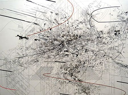
Upon first glance, the image "Dervish" seems to be a cluttered mess of black and white that has been accented with occasional and seemingly arbitrarily placed lines of thick black and red; however, upon closer inspection, one can see that the artist's use of line is not as capricious as it may seem. The piece is developed on layers of lines -- the "background" looks like the blueprint to a building or a technical drawing from a set of instructions. Depth and form are also implied with the use of lines: grids move into the background on both sides of the piece and details get more condensed and darker as they recede. As well, emphasis is placed on the center where the highest concentration of lines is present. From this darker contrasting center, the lines move outward in sinuous billowing fashion -- not taking any real corporal form, but implying the movement of waves, wind, and giving the downy appearance of clouds.
From this wild use of line, the piece seems to bring the viewer a chaotic and explosive feeling. On top of the sterile and flat technical lines, the artist has created this whirling cluster of movement that controls the feeling of the work. It brings excitement and interest to the piece. The huge mass of indecipherable lines exists overtop or inside of the technical space that the artist has created and is moving out of the confines of the technical blueprints. This may allude to some idea the artist might have regarding confinement and breaking free from constraints put upon us by society or some other force.
Overall I feel that the work is compelling and interesting. It's not necessarily a piece that catches one's fancy upon immediate inspection because the abstractness makes it a bit austere, but I think the detail and movement of it really draw the viewer in and make it an intriguing piece.
Subscribe to:
Comments (Atom)